気になる英語ニュース「100歳まで生きるには、どれだけのお金が必要?」
tsuyo4wa
英会話トレーニングで英語力アップ!10min English

こんにちは!エミリーです。今日は、毎日海外のニュースをひとつピックアップして伝える「エミリーの気になるニュース」のコーナーをお届けします。
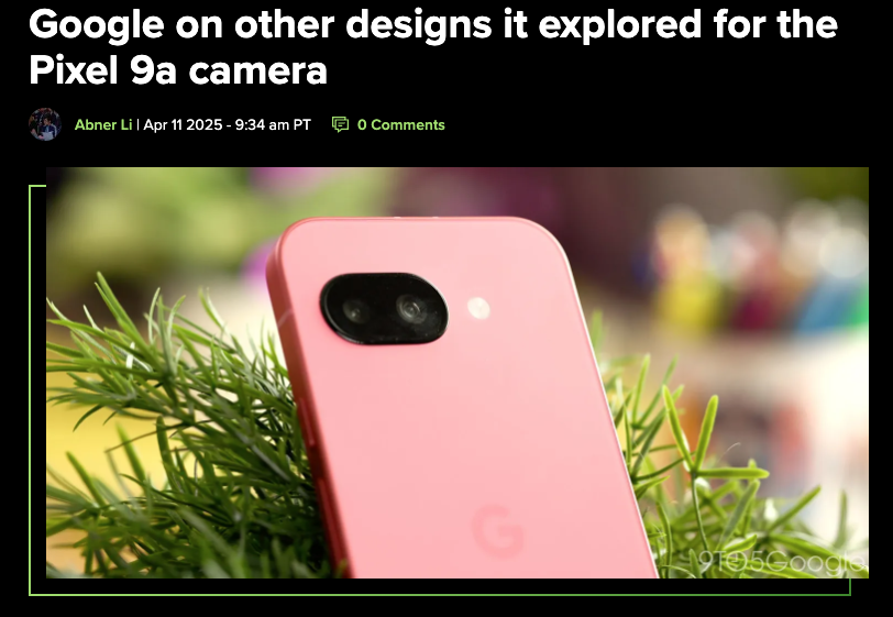
今回のニュースは、Googleが最近発表したスマートフォン「Pixel 9a」のカメラデザインについて、最終デザインに至るまでに検討された他のデザイン案を公開したという内容です。
実は私、ガジェット好きで、特にカメラ性能の良いスマホを愛用しています。デザインの裏側にはどんな検討がされているのか、とても興味深いですよね!
このニュース記事を題材に、英語学習のポイントを交えながら、テクノロジーやデザインに関わる英語表現を分かりやすく解説していきたいと思います。一緒に学んでいきましょう!
Following the Pixel 9a release, Google shared more about the phone’s design, including other looks it explored for the camera. Google “explored a variety of designs for the rear camera bump,” and shared a low-resolution image of those other takes.
These images show their rear camera bump shape study, which focused on its overall form and appearance as well as certain shapes’ ability to withstand drops and impact. Something close to the final design appears at the center of the top row, with Google ultimately using a pill that’s minimally domed.
The first image shows a bump that nearly spans the entire width of the device. That design would have looked closer to the Pixel 9 and 9 Pro, but without the elevation. Some people might have preferred if Google went that route to maintain the lineage.
Google also switched to a thinner plastic OLED (pOLED) panel that made possible “more internal space for the battery and allowed the team to lower the camera placement to minimize the bump, all while maintaining that durable, mid-frame architecture.” This change unexpectedly improved the display, boosting peak brightness from 2,000 to 2,700 nits.
For colors, Google confirms that Iris is “like an update to [the Purple-ish] colorway” on the Pixel 3a, which was a fan-favorite. “At first glance, Iris can appear blue or purple. It feels calm yet confident, opinionated yet widely appealing, making it the perfect hero color for the new A-series.”
Pixel 9aの発売後、Googleはスマートフォンのデザインについて、カメラのために検討された他のデザイン案も含めてさらに詳しく公開しました。Googleは「背面カメラバンプのために様々なデザインを検討した」と述べ、それらの案の低解像度画像を共有しました。
これらの画像は背面カメラバンプの形状研究を示しており、全体的な形状や外観だけでなく、特定の形状が落下や衝撃に耐える能力にも焦点を当てています。最終デザインに近いものが上段の中央に表示されており、Googleは最終的に最小限にドーム型になったピル形状を採用しました。
最初の画像はデバイスの幅全体にほぼ及ぶバンプを示しています。そのデザインはPixel 9や9 Proに近い外観になりますが、高さはありません。一部のユーザーは、Googleがこの方向に進んでシリーズの系譜を維持する方が良かったと思うかもしれません。
Googleはまた、より薄いプラスチックOLED(pOLED)パネルに切り替え、「バッテリー用の内部スペースを増やし、耐久性のあるミッドフレームアーキテクチャを維持しながら、カメラの配置を下げてバンプを最小化することを可能にした」と述べています。この変更は予想外にディスプレイを改善し、最大輝度が2,000ニットから2,700ニットに向上しました。
カラーについて、GoogleはIrisが「Pixel 3aの[紫がかった]カラーウェイのアップデートのような」ファンに人気のあるカラーであることを確認しています。「一見するとIrisは青または紫に見えます。落ち着きがありながらも自信に満ち、個性的でありながらも幅広い魅力があり、新しいAシリーズの主力カラーとして完璧です」
今回は、スマートフォンデザインやテクノロジーに関連する英単語や表現を紹介します!最新ガジェットについて英語で話す時に使えるフレーズばかりですよ。それでは、一緒に見ていきましょう!
ニュースについてディスカッションをしてみました!話し合うことで英語力がアップしますので、私たちの会話フレーズを参考にお友達と話をしてみてくださいね!
Emily: 10minガール。サイトの運営者。
Sara : エミリーの友達。グラフィックデザイナー。
Jake : エミリーの友達。旅行ライター兼ブロガー。
Emily: Hey guys! Did you see the article about Google sharing their design process for the Pixel 9a camera?
Sara: I did! As a designer, I love when companies show their behind-the-scenes process. It’s fascinating to see all the options they considered.
Jake: I actually missed that! What kind of designs did they explore? I’ve always thought the camera bump on phones is getting too prominent these days.
Emily: They showed several different designs for the camera bump. Some were wider, spanning almost the entire width of the phone, and others were more compact. They eventually went with a pill-shaped design that’s minimally domed.
Sara: What I found interesting was how they balanced aesthetics with practical concerns like durability. They specifically tested how different shapes would withstand drops and impacts.
Jake: That makes sense. I’ve dropped my phone so many times while traveling and taking photos. It’s good to know companies are thinking about clumsy people like me!
Emily: Right? I’m the same way! And did you notice how they mentioned changing to a thinner pOLED display panel? That gave them more internal space for the battery.
Sara: Yes, and it’s interesting that they weren’t actually trying to improve the display, but it ended up being better anyway. The brightness increased from 2,000 to 2,700 nits!
Jake: What does “nits” mean in this context? I’ve heard it before but never really understood it.
Emily: It’s a measurement of brightness! One nit equals one candela per square meter. Higher nits mean a brighter screen, which is especially helpful outdoors in sunlight.
Sara: Exactly. And as a designer, I’m intrigued by their new “Iris” color. They described it as a color that can appear blue or purple depending on how you look at it.
Jake: That reminds me of that dress that went viral years ago that people couldn’t decide if it was blue and black or white and gold!
Emily: Haha, yes! Though hopefully less controversial. I love that they described the color as “calm yet confident, opinionated yet widely appealing.”
Sara: That’s such evocative language for a color description. As a designer, I appreciate when companies put that much thought into color psychology.
Jake: I’m more practical – I just want to know if the camera takes good photos for my travel blog! Do you think the design changes will improve the photo quality?
Emily: The article didn’t specifically mention image quality improvements, but generally, more space for camera components often leads to better photos. Plus, the brighter screen will make it easier to see what you’re shooting in bright sunlight.
Sara: And don’t forget that the case design lets you see the phone’s color through the camera cutout. I think that’s a clever design touch.
Jake: I never thought I’d be so interested in smartphone design! But it’s fascinating how much thought goes into every little detail.
Emily: That’s why I love learning about tech in English – there are so many specific terms and nuanced descriptions. It really expands your vocabulary!
Sara: Absolutely. Words like “minimally domed” and phrases like “withstand drops and impact” are so specific to product design discussions.
Jake: Well, now I’m curious to see the Pixel 9a in person. Maybe it’s time for a phone upgrade!
Emily: Let me know if you get one! I’d love to test out that camera on our next English practice meetup!
エミリー:ねえ、みんな!GoogleがPixel 9aカメラのデザインプロセスを公開した記事を見た?
サラ:見たわ!デザイナーとして、企業が舞台裏のプロセスを見せてくれるのが大好き。検討されたすべての選択肢を見るのはとても興味深いわ。
ジェイク:実は見逃してた!どんなデザインを検討したの?最近のスマホのカメラバンプは目立ちすぎると思ってたんだ。
エミリー:カメラバンプのいくつかの異なるデザインを見せてたよ。スマホの幅全体にほぼ及ぶような幅広いものや、よりコンパクトなものもあったわ。最終的には、最小限に膨らんだピル型のデザインを採用したんだって。
サラ:面白いと思ったのは、美しさと耐久性のような実用的な懸念のバランスをどうとったかよ。特に異なる形状が落下や衝撃にどう耐えるかをテストしてたのね。
ジェイク:それは納得だよ。旅行中や写真を撮るときに何度もスマホを落としたことがある。企業が僕のようなドジな人のことを考えてくれてるのは嬉しいね!
エミリー:そうよね?私も同じ!それと、より薄いpOLEDディスプレイパネルに変更したって言及してたの気づいた?それでバッテリーのための内部スペースが増えたんだって。
サラ:うん、そして実際にはディスプレイを改善しようとしてたわけじゃないのに、結果的に良くなったのが興味深いわね。輝度が2,000から2,700ニットに向上したなんて!
ジェイク:この文脈での「ニット」って何を意味するの?前に聞いたことはあるけど、実際には理解してなかったんだ。
エミリー:輝度の測定単位よ!1ニットは1平方メートルあたり1カンデラに相当するの。ニット値が高いほど画面が明るくなり、特に屋外の日光の下で役立つわ。
サラ:そのとおり。そして、デザイナーとして、新しい「Iris」カラーに興味をそそられるわ。見る角度によって青や紫に見えるカラーだって説明してたわね。
ジェイク:数年前に話題になった、青と黒か白と金か人々が決められなかったあのドレスを思い出すよ!
エミリー:ハハ、そうね!でも、希望としてはあれほど議論を呼ぶものではないでしょうね。「落ち着きがありながらも自信に満ち、個性的でありながらも幅広い魅力がある」というカラーの説明が素敵だと思うわ。
サラ:それは色の説明としてとても印象的な言葉遣いね。デザイナーとして、企業がカラー心理学にそれほどまで考えを巡らせることに感謝するわ。
ジェイク:僕はもっと実用的なところに興味があるよ – 旅行ブログ用に良い写真が撮れるかどうかが知りたいんだ!デザインの変更で写真の品質は向上すると思う?
エミリー:記事では画質向上について特に言及されてなかったけど、一般的にカメラコンポーネントのためのスペースが増えると写真の質が良くなることが多いの。それに、明るい画面があれば、明るい日差しの中で撮影対象を見やすくなるわ。
サラ:それと、ケースデザインがカメラ部分の切り抜きからスマホの色が見えるようになってるのを忘れないで。それは巧みなデザインのアクセントだと思うわ。
ジェイク:スマートフォンのデザインにこんなに興味を持つとは思ってなかったよ!でも、どんな細部にもどれだけの考えが込められているか、魅力的だね。
エミリー:だから英語でテクノロジーについて学ぶのが好きなの – 多くの特定の用語や微妙なニュアンスの説明があるでしょ。本当に語彙が広がるわ!
サラ:確かに。「minimally domed(最小限に膨らんだ)」のような言葉や「withstand drops and impact(落下や衝撃に耐える)」のようなフレーズは、製品デザインの議論に特有ね。
ジェイク:さて、実際にPixel 9aを見てみたくなったよ。スマホのアップグレードの時期かもしれないな!
エミリー:もし手に入れたら教えてね!次の英語練習の集まりでそのカメラをテストしてみたいわ!
これらの表現は、テクノロジー製品やデザインについて議論する際によく使われます。これらの語彙を習得することで、最新ガジェットについて英語で議論できるようになるでしょう。
これらの単語は、スマートフォンやテクノロジーデザインに関連しています。これらの語彙を習得することで、製品デザインについて英語で話し合うことができるようになるでしょう。ニュースを読む際や、友人との会話の中で、これらの単語を使ってみてくださいね。
気になるニュース「Googleが明かすPixel 9aカメラデザインの舞台裏!他に検討されたデザイン案とは」でした。
Let’s enjoy 10 minutes of English together every day!
毎日10分、一緒に楽しく英語を学びましょう!